Why Your Service Page is a Decision Tool (Not a Menu)
A decision tool is for when the user knows they have a problem but doesn’t know how to solve it.

If you are unable to read this article in its entirety, click here.
Imagine a service page for a high-end consulting firm. It is a masterpiece of professional design — clean typography, high-resolution imagery, and a perfectly balanced grid. But as I imagined, I felt my brain start to itch.
The page lists twelve different “solutions.” Each one has a bulleted list of deliverables, a brief paragraph on methodology, and a “Learn More” button. It is a comprehensive menu. It is also, functionally, a dead end.
When a potential client lands on your service page, they aren’t looking for a buffet. They are looking for a way out of a specific, stressful situation. If they have to do the heavy lifting of figuring out which of your twelve solutions fits their unique mess, you haven’t helped them — you’ve just given them a new task to complete.
The Menu Trap
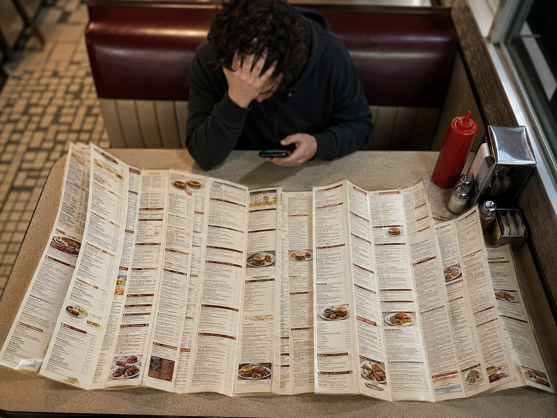
Most businesses treat their service pages as a repository of everything they can do. This reflex is completely understandable: the fear behind it is real. If we don’t list it, they won’t ask for it. No one wants to lose a lead because a capability was hidden.
But listing everything creates a paradox of choice. When you present ten options with equal visual weight, the user’s brain defaults to “I need to think about this,” which usually translates to “I’ll come back to this later” (and then they never do).
A menu is for when the user knows what they want but doesn’t know where it is. A decision tool is for when the user knows they have a problem but doesn’t know how to solve it.
That distinction matters because it changes what you optimize for. A menu optimizes for coverage. A decision tool optimizes for momentum.
The 10-Second Clarity Test

To move from a menu to a decision tool, your page needs to pass a simple test: Can a tired, distracted person understand exactly what you do and who it’s for in ten seconds?
If I have to read more than two sentences to understand the outcome of your service, the architecture is failing.
The goal isn’t to be “concise” for the sake of brevity. It’s to reduce the cognitive load required to reach a “yes.” You want to move the user from What is this? to This is for me. as quickly as possible.
How to Re-Architect the Page
If your current page feels like a sprawling list, try these three shifts:
1. Lead with the Transformation, Not the Task
Instead of “Custom Web Development Services,” try “A website that handles your lead generation while you sleep.” One is a task you perform; the other is a result they desire. Start with the result.
Before: Website Design | Branding | SEO | Maintenance | Consulting
After: Launch a clear starter site | Improve a site that’s not converting | Get help maintaining what you already built
Notice how the second list doesn’t just rename services — it names the situations a visitor is actually in. The visitor sees themselves in the description, not a catalog of your skills.
2. Curate the Path
If you offer many things, don’t show them all at once. Group your services into two or three clear paths based on the situation your visitor is in. (The number isn’t magic — it’s the limit of what a distracted working memory can hold without dropping a thread.)
If a user doesn’t fit into one of those paths, they probably aren’t your ideal client anyway. By narrowing the focus, you make it easier for the right people to say yes.
3. Externalize the Logic
If your service requires nuance to explain, don’t try to cram that nuance into a hero section. Use a “Choose your path” framework. Ask one qualifying question and point them to the section that applies.
For example:
- Are you launching something new? → See “Starter Sites”
- Are you fixing something that already exists? → See “Rescue & Repair”
This moves the thinking from their brain onto your page. You do the sorting so they don’t have to.
When a Menu Is Actually the Right Choice
None of this means menus are always wrong. If your visitor is a returning client who already knows they need a specific, named service — say, a monthly SEO retainer or a brand refresh — then a clean, scannable menu is exactly what they want. They don’t need persuasion; they need speed.
The decision-tool approach is for the first-time visitor who is still diagnosing their own situation. Build for them. Your repeat clients will forgive a little scrolling.
The Durable Result
When you stop trying to be everything to everyone on a single page, you actually become more useful to the people who need you most.
A service page shouldn’t be a trophy case of your capabilities. It should be a bridge. If that bridge is cluttered with unnecessary decorations and too many exits, people will stay on the shore. Clear the path. Make the decision easy.
Next week, I’ll look at the same principle from a different angle: how the navigation and overall site structure — not just the service page — can either guide visitors forward or leave them standing in the lobby wondering which door to open.
If this piece helped you think differently about work, systems, or building a life that can hold real human limits, follow Bluedobie Dialogues for more essays on sustainable business architecture, practical workflows, and the human side of building things.
Melanie Brown writes the Bluedobie Dialogues series about systems thinking, sustainable business architecture, and what durability actually looks like in practice. She is the founder of Bluedobie Developing, a rural Kentucky-based SaaS and web development company, and the creator of DobieCore — an AI content platform for small business owners.