Stop Organizing Your Site for Yourself
If your navigation feels like a puzzle, it’s probably because you’re solving it for yourself.
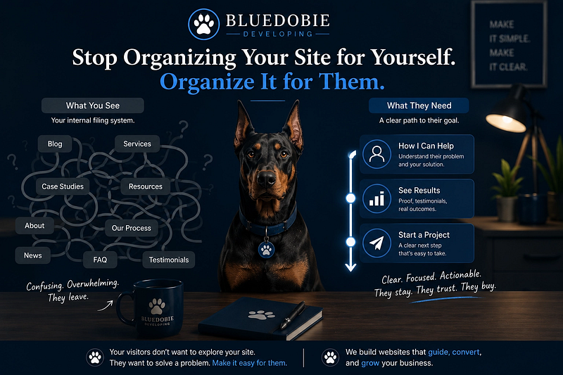
Most websites are organized like a filing cabinet: every document has a correct drawer, and the system makes perfect sense to the person who built it. The problem is that visitors don’t bring a filing key. They bring a problem they want solved.
Last week I wrote about how a service page should function as a decision tool, not a menu — about the psychology of a single page where someone chooses whether to work with you. This piece is about the architecture that gets them there in the first place. If that essay was about the room, this one is about the hallway.
We often fall into the trap of designing navigation based on how we think about our work. We build “buckets” that make sense to us — the creators of the system — while ignoring the mental models of the people actually trying to use it.
If your navigation feels like a puzzle, it’s probably because you’re solving it for yourself.
The Taxonomy Trap
When we build a website, our first instinct is often to organize by type.
- Is this a blog post?
- Is this a service offering?
- Is this a case study?
These are internal classifications. They describe what the content is to the business owner. But for a visitor, these categories are often irrelevant. A potential client doesn’t care that a piece of content is a “Case Study”; they care that it’s “Proof that I can solve their specific problem.”
There is one case where taxonomy-first navigation makes sense: when the user already knows exactly what they want and just needs a catalog. A wholesaler restocking inventory doesn’t need “Find the Perfect Treat.” They need “Treats > Bulk > Under $20.” Intent-forward design isn’t about eliminating categories — it’s about knowing when the category serves the user and when it serves your own need for order.
When we prioritize taxonomy over intent, we force the user to do the heavy lifting. We ask them to understand our internal filing system before they can find the value we provide. That is a high cognitive load, and it’s one of the quickest ways to lose someone’s attention.
Navigation as Empathy
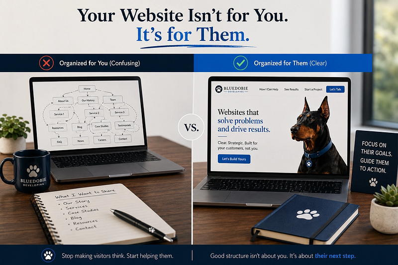
Navigation is an act of empathy. It requires us to step out of our own heads and inhabit the headspace of a person who has no context for our history, our internal processes, or our personal preferences.
That costs something specific: you have to let go of the taxonomy you spent hours perfecting. The categories that made sense in your planning meeting have to be translated into someone else’s language. It’s not a knowledge problem. It’s a humility problem.
Think about the difference between a map and a GPS. A map shows you everything — the landmarks, the side streets, the topography. It’s great for orientation, but it requires you to know how to read it. A GPS only shows you the next turn. It cares about your destination.
Good navigation should function like a GPS. It should be “intent-forward.”
Instead of asking, “Where does this page live in my brain?” ask, “What is the user trying to achieve in the three seconds they spend looking at this menu?”
Moving from “What” to “Why”
To shift toward empathy-based navigation, we have to move from organizing by what the content is to why the user needs it.
Consider a consulting business.
- The Internal View: Services, About Us, Blog, Testimonials, Contact.
- The Empathy View: How I Can Help, See the Results, Who I Work With, Start a Project.
Or consider a pet supply shop.
- The Internal View: Dog Food, Treats, Toys, Grooming.
- The Empathy View: My Dog Is a Picky Eater, I Need a Birthday Gift, My Senior Dog Has Joint Pain.
One organizes by inventory. The other organizes by the emotional moment the shopper is in.
Both versions acknowledge the user’s journey. They anticipate the questions visitors are asking themselves. They reduce the friction between “I have a problem” and “I found a solution.”
This doesn’t mean you can’t have a logical structure. It means the interface of that structure must be mapped to human psychology, not just database logic.
Designing for Variable Capacity
One of the core principles of durable systems is designing for “ordinary days.” On a high-energy day, a user might be willing to click through three layers of nested menus to find a specific white paper. On a “migraine day” — or just a busy Tuesday — they want the answer in one click.
If your navigation requires a high level of “system literacy” to use, it will fail when your users are tired, distracted, or in a hurry.
Empathy-driven navigation prioritizes the path of least resistance. It puts the most common needs front and center and hides the “nice-to-know” details in secondary layers. It respects the user’s time and cognitive energy.
The Practical Shift
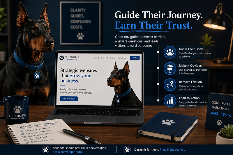
If you’re looking at your current site architecture and feeling that “it makes sense to me, but does it make sense to them?” friction, try this:
- Audit your menu items. For each one, ask: “Does this describe a category of content, or a goal the user wants to achieve?”
- Map the “Job to be Done.” Write down the three most common reasons someone visits your site. Do those three things have a clear, direct path from the homepage?
- Reduce ambiguity at each step. If a user can’t tell whether each click is getting them closer to solving their problem, the system is carrying too much weight. People will follow a clear path through ten steps if every step feels like progress. The danger isn’t depth — it’s doubt.
Stop building a library for yourself. Start building a path for them.
If this piece helped you think differently about work, systems, or building a life that can hold real human limits, follow Bluedobie Dialogues for more essays on sustainable business architecture, practical workflows, and the human side of building things.
Melanie Brown is the founder of Bluedobie Developing, a rural Kentucky-based SaaS and web development company, and the creator of DobieCore — an AI content platform engineered to give small business owners professional results without the prompt engineering learning curve. She writes the Bluedobie Dialogues series about systems thinking, sustainable business architecture, and what durability actually looks like in practice.